
PalSync
Reimagining a finance-syncing experience — from an idea to the last Shopify illustration, we gave PalSync the foundation of what a good product should be and a clean, confident visual identity users could trust instantly.
What we worked on
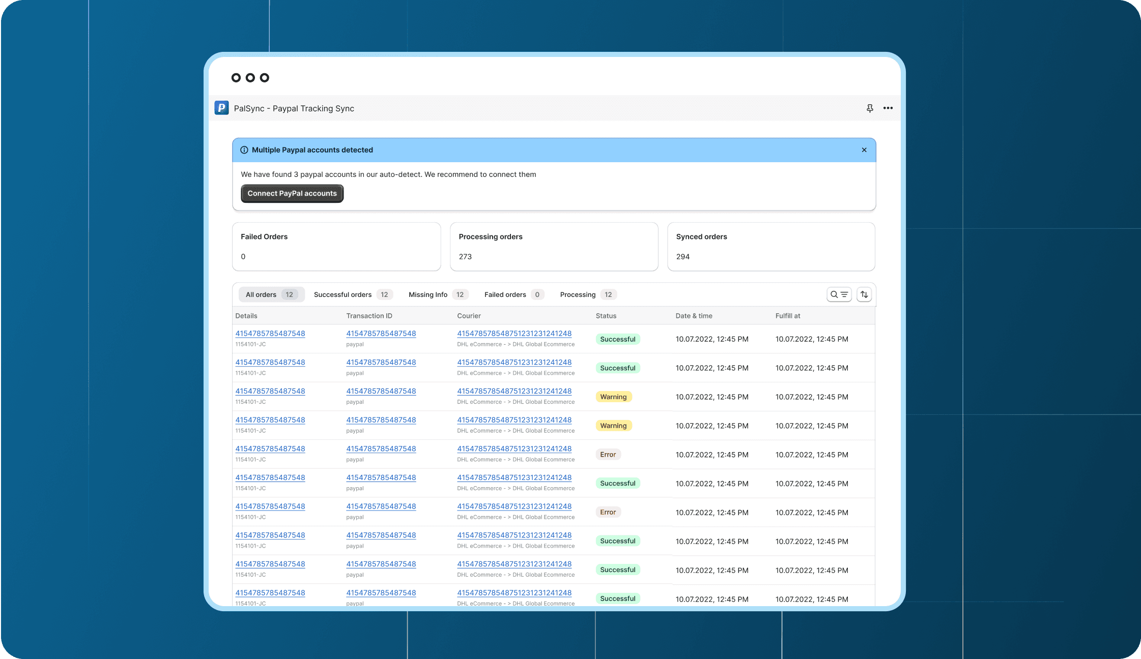
Built for Shopify Designs
App Illustrations
App Store Images
Branding
Logo Design
Timeline
1 Month
Challenge
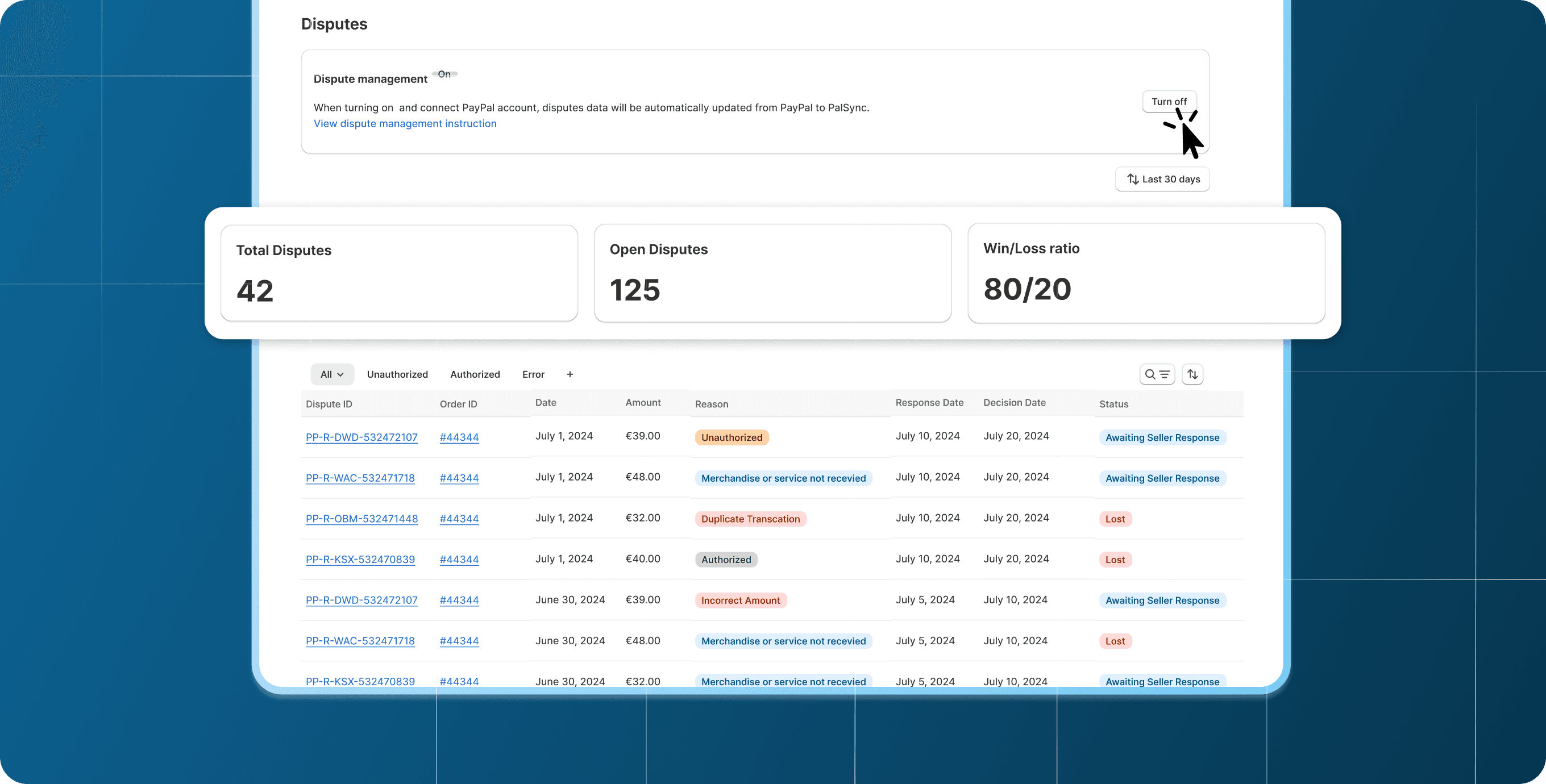
PalSync is a financial synchronization tool that allows merchants to integrate payment flows seamlessly into their Shopify stores. The tool was the address the payment synchronization in the shopify space which was a difficult challenge but what we did was:
A functionality and simple product experience
A unique visual identity that distinguished it from competitors
Shopify-native UI styling
On-brand illustrations for both the app and store listing
A clear logo that communicated credibility and finance-first reliability
The team needed a full visual refresh that could scale across the app, app store listing, and brand assets — all under tight time constraints.
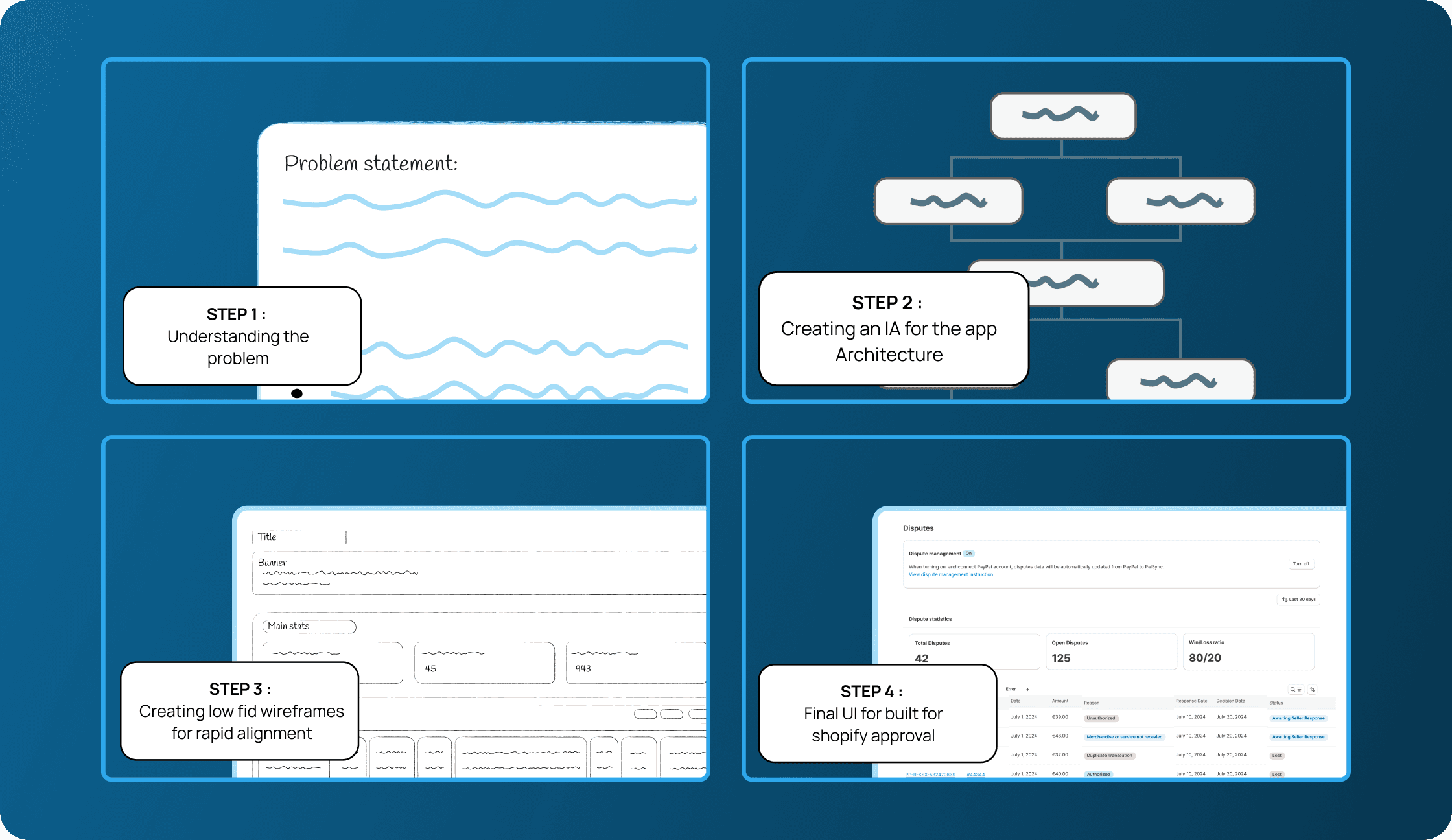
Phase 1: Understanding the problem
Competitor Analysis: Studied competitor Shopify apps enable such a service
Audit: Identified gaps and opportunities in the designs
Visual direction: Created moodboards and style directions for visual alignment
Phase 2: Creating a IA structure and user flows
Documentation: Documented the products and user flows to identify gaps and find opportunities of improvement in the product.
Phase 3: Low-fi
Design: Designed all the flows in Polaris, different use cases and error states. Ensured all visuals had a light, clean and clear visual language that resonates with Shopify merchants in recognising functionality and leveraging the features for maximum effectiveness. Designed component-based design specs for faster dev handoff.
Support guidelines: Created support and documentation guidelines.